Determine form-sheet or navigation controller presentation

June 29th, 2016

I recently ran into a situation where I needed to determine if a view controller was in a form sheet, or pushed onto a navigation stack.

A pattern I use for things like Settings in a universal app is to push the Settings view controller onto the stack, when on the iPhone, and wrap it in a UINavigationController and present that as a form sheet on the iPad. This works well, but I've been working on making my apps adaptive, and my old method of deciding which to use based on the UIUserInterfaceIdiom is not going to cut it in an adaptive world.

One odd thing about UIPresentationController is it doesn't seem to have a way to determine how a view controller is currently presented. You can find out how the view controller would like to have been presented, but this doesn't always match what it actually did.

In the end I kind of cheated, but I feel like it's a good cheat so I'm sharing it.  It boils down to this:

    if (self.navigationController.viewControllers.count > 1) {

        // No "Done" button when in a navigation controller, use the Back button

        self.navigationItem.rightBarButtonItem = nil;

    }

If the view is the only view in its navigation controller, then I want the done button, otherwise, the user will use the navigation controller's Back button to navigate away.

Writing with Tools

November 28th, 2015

I have always wanted to write more. Every time I get the itch to write something substantial, there is a pattern that plays out. The first thing I do is think “I need to find a great app to write in” and get totally sidelined by downloading and trying out writing apps.

This makes no sense, of course. I know most of what I read is written in BBEdit, Scrivener, or Microsoft word, and that it doesn’t matter. It’s all text, and all a writing app needs to do, most of the time, is make sure the keys you press on the keyboard show up as words on the screen.

But, as I am typing this in Editorial on the iPad, I am looking for a word count and not seeing one. Now I am distracted. It also doesn’t support iPad multitasking. That’s no good. Hmm, what else do I have.

So, now I am in Byword, which supports multitasking and which has an on-screen word count indicator, although it takes up a lot of space. Must resist.

The next challenge is how do I get text from Byword onto my blog. It would be nice if I could use a WordPress extension. Let’s see if that works.

Nope, although I could post directly to Tumblr if I wanted to. Maybe this is why people rave about the Workflow app. Back in a minute.

Playing with Workflow. Hang on.

Ok I think I have a workflow that will let me post this, and Workflow is cool, but it seems that if I want to edit this post later that would be a whole different process. Still, if this makes it to the blog then at least my tool indulgence has resulted in some output.

Nope, when I tried to run the workflow, I got a cryptic “unsupported URL” alert.

But I see Byword has direct support for publishing to WordPress. Let’s try that.

Does anyone else find the tools this distracting?

I published this in Byword, but I don't see how I can update a post in Byword, so here I am I the WordPress app updating this post.

Darkness under Navigation Controller

September 13th, 2015

Translucent navigation bars are cool. The content that scrolls up off the visible area alters the look of the navigation bar. But they do introduce some complexity, and sometimes you just don’t need it, because your content doesn’t scroll.

So let’s say you’ve got an app that has some content that does scroll, like a UITableView, so you turn on the translucent navigation bar. But then you want to push a view controller that doesn’t scroll.  

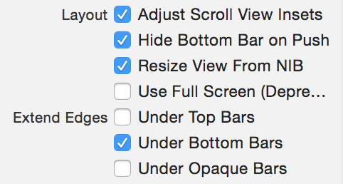
So you go into Interface Builder, select your view controller, and turn off “Extend Under Top Bars”.

Under Top Bars Off

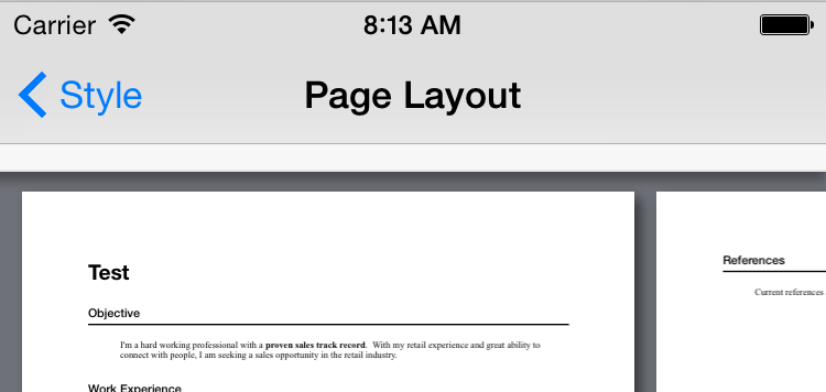
But now you get this:

Dark Navigation Bar

It’s almost as the invisible content underneath the translucent navigation bar was black. And that’s because it probably is.

This looks ugly, and it looks especially ugly when it’s animating in, because the white turning black is part of the push animation.

The best way I’ve found to fix this is to put a view above your main view, that acts as a white filler that the navigation bar can use for its translucency.

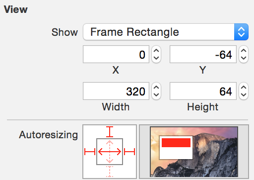
Drop in a new view, and update its size and position so that it’s above the navigation bar.  You may want to calculate the navigation bar height at runtime, but here I’m just using the size that’s applied since the dawn of iOS, 64 points:

Filler View Size

Make sure to set up the autoresizing mask, or constraints, so it adjusts automatically for different device sizes.

End result?  No more smudge underneath the navigation bar.

After

Much nicer.


Apple Ads on the Web

August 5th, 2015

Listening to a recent episode of The Talk Show, John Gruber and Jason Snell were talking about advertising.  John’s talked about this before, about the mess that is web advertising these days, and Jason gave some great insider perspective, as a long-time MacWorld editor.

Setting aside whether ads are good or bad, the web today needs ads to run. But the way that advertising is currently implemented is terrible. The sites that create content, like iMore or MacWorld, have to insert JavaScript from ad networks with no idea what’s going to end up being inserted into their pages, and often what ends up there is poor quality, both in content and in implementation.

John also brought up page load times, and ads are a big part of that.

Wouldn’t it be nice if there were a single, web-wide ad tracking standard?  And wouldn’t it be nice if your phone had the ability to pre-cache the ads, so that loading ads wouldn’t be slowing down your web surfing?

Nice is relative of course - having your phone downloading ads in the background for later presentation actually sounds kind of terrible, but look at it this way - your phone could download ads overnight or while on WiFi, so that on a slower network, the ads would already be local. 

There’s one company in a position to actually do this. Apple.

An Apple-provided extension to iAd that took on web advertising, not just in-app advertising, could really improve how ads are presented on iOS, in ways that no other ad network could. You’d save bandwidth and battery while surfing sites that used Apple’s ads, and the sites would load faster.

I have no idea if Apple is working on this, but changing the status quo, for the benefit of end users, in a way that makes their platform better, sounds like something they’d do.

Google could do it too, but in my mind it’s not as good a fit for Google.  More mobile web surfing happens on iOS, and richer ads are better than simpler ads.  Apple dabbled in rich ads with iAd, and I could see them taking this father.  A cached rich ad “experience” can be presented with no download time, and could be much more effective than the typical Google ad inventory.

App Store Curation

July 8th, 2015

Now that Apple Music is out, and people are seeing how well the curation works, I’ve seen people ask about curation in the App Store.

Seems to me Apple is already doing this, and has been for a long time

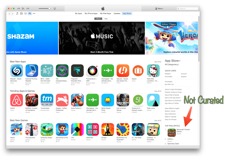
Go look at the App Store.  What do you see?  Almost all of the iTunes front page is curated content.

NewImage

Big banners at the top for hand-chosen featured apps.  “Best New Apps”, again hand-picked.  “Best New Games”.  “Trending Apps & Games” (which I believe is also hand-picked, although likely hand-picked from the actual trend data).

Then there’s a collection of curated lists of apps.  “Disney Bundles”.  “Editor’s Choice”.  “App of the Week”.  “Essentials”.  “Great Free Apps”.

“Recommended Apps & Games”.

“15 Most Challenging Games”.

“Backyard BBQ” (apps for planning, cooking, and fun at your BBQ).

This is curation, and the App Store is doing a great job of it.

Personalized recommendations is a different ball game. Apple Music algorithmically chooses curated playlists to recommend to you; it’s a mix of curation and data mining.  The App Store doesn’t seem to do any of the latter - it doesn’t use what it knows about you to suggest apps to you.

Getting Comfortable with Apple Music

July 5th, 2015

Apple Music is a big change. No matter what you used for music previously, Apple Music is different. It’s an exciting service, and it’s doing a great job of getting me back into music. But it’s also confusing.

I’ve spent a lot of time with Apple Music lately, and I wanted to share some things I learned that have helped me get comfortable with it.

Think of the tabs as separate apps.  This is an important point, because sometimes what you can do depends on where you are.

If you tap on a tab, it will take you to where you last were on that tab (if you’d tapped on a playlist, or artist, for example) but tapping the tab again will take you back to that tab’s home. Remember that one, it’s useful.

Curated Playlists

The curated playlists are a big part of Apple Music, but conceptually you can think of them as albums. Unlike algorithmic music services, these playlists are fixed length, typically about 80 minutes, and are assembled by humans, so they tend to be a pleasant collection of songs that work well together.

This means you can do things with playlist suggestions like add them to you music library, and make the songs in them available for offline listening, something you can’t do with a radio station.

For You

This is Apple Music’s main recommendation engine, and using your preferences and some other data (it’t not exactly clear what, but I believe your previous play history has something to do with it), Apple Music will add albums, and curated playlists, to the For You recommendation list.

This list keeps growing as you use the app, so you don’t have to worry about losing recommendations as new ones become available.

Right now, for me, “Modern Breakup Songs” and “Rush 80’s” my top For You recommendations.  If you don’t like a recommendation, tap and hold on it for a second, and the menu that appears has an “I Don’t Like This Suggestion.” menu item.  Tap that, and hopefully you’ll see fewer suggestions like that in the future (although in practice, it hasn’t make a lot of difference in my case, yet).

Pull to refresh.  If there are new suggestions, they will appear at the top. 

The plus button adds stuff to your iTunes Music Library, essentially adding it to the My Music tab.  This doesn’t make it “your” music, the same way purchasing it does, which is a bit confusing. What you’re adding is more like a shortcut to the music in Apple Music, that will disappear if you ever unsubscribe.

Radio

There are two things here:  Beats 1, which is live, and you have no control over, and algorithmically-generated radio stations.

If you tap on a station, like “Pop Hits”, the app will start playing an appropriate song.  If you don’t like it, you can skip it (although skipping it does nothing to change the content that the station will play).  There’s no way to feed back that it made a bad choice.

You can create a new radio station from a song or album. I don’t know if there’s any human curation involved in these playlists, but they seem roughly equivalent to the same feature on Spotify.

Now Playing

When you’re listening to a song, there’s a bar above the tabs that shows the song that’s currently playing.  

Tap the heart to indicate that you love a song. This feedback is used to help improve the suggestions on the For You tab, and apparently have nothing to do with radio stations.

Tap and hold the fast forward or rewind buttons, to have the app skip forward or back within the current song, instead of instantly switching songs.

One question I have about the heart, and liking music, is what happens when a song is on more than one album?  Liking it in one place doesn’t automatically like it in the others, so what does that mean for how it uses that data for recommendations?

New

New is a weird tab.

Here you can find new music.  But you can also Apple Editor’s Playlists, Activity Playlists, and Curator Playlists. 

There’s a drop-down at the top for picking a genre, which changes some of the content on the tab, but not all of it. The curated playlists don’t seem to change, but the top lists and other content does change to match the genre you picked.

Honestly I spend very little time on this tab, except when I want to find music to match a mood (something Spotify was pretty good at).  There are a lot of great playlists in here, but you need to tap the New tab, scroll to Activity Playlists, and then pick a genre to get to them.

The “Hot Tracks” and other top playlists don’t take my taste into account at all, and so are generally useless. There’s definitely an opportunity to do better here.

Connect

Connect is a curiosity at this point.  Sometimes there’s interesting stuff in there, but I don’t know how valuable it will be.

Clean vs Explicit

Apple Music respects the setting you set in the Allowed Content section of Settings / General / Restrictions in the system Settings app. It’s a shame there’s no easy way to toggle this, because for me it really depends on “are there kids in the car”.

Search

Search is global - it doesn’t matter where you are in the app when you hit the search button.  The app will present search results from all over the service, including curated playlists, music videos, and results from your own music library.  It works pretty much as you’d expect.

Offline

Figuring out exactly what you can listen to offline isn’t obvious, but you can take any song, album, or playlist in the My Music tab and tap it’s menu button to show the menu, and then pick “Make Available Offline”.  This will copy the files to your device. You can change a setting to indicate whether Apple Music is allowed to use cellular data to stream music, but unfortunately, like the Clean setting, this is buried off in the system Settings app, so it’s awkward to change on the fly.

If a curated playlists calls for a song that you have locally on your device, then it will play the local copy.  Seems obvious, but I think this is a cool feature.

Overall

I have a lot of music - over the years I’ve bought hundreds of albums, and they’re all ripped and in my music library, but the challenge has been finding a way to really enjoy all this music.  Genius tried, but wasn’t very good. Spotify didn’t seem to really care much about my music collection, nor did Rdio.

Apple Music often suggest I listen to music I already have, often music that I haven’t listened to in ages. And then will stream it from my local copy.

With Apple Music, I'm finding it’s easier to just get some music playing that I like, and that’s what it’s all about.
Using a Grocery List on the Apple Watch

April 29th, 2015

Not every app should support the watch, but when the Apple Watch was announced, the one use case that immediately seemed obvious to me was quick access to a grocery list.

I built this feature for MealPlan, putting a good amount of work into getting it to stay in sync with the main iPhone app, which also syncs with the cloud.  This means you can plan your weekly meals on the iPad, and then have the grocery list automatically generated and on your watch when you’re in the store.

April 24th, the watch launched, and customers were able to try this for the first time. And so was I.

I didn’t have a watch pre-launch, and I didn’t get invited to any of the WatchKit labs.  Like most other developers, I was flying blind when it came to understanding the nuance of what would make an app work well on the watch.

But I did get my watch on April 24th, and discovered with some disappointment that my app had some technical difficulties on the physical device. You had to have the iPhone app open or the watch app wouldn’t be able to retrieve your grocery list. I quickly fixed this, and to their credit, Apple approved the update within 24 hours (no expedited request required).

So now that I had my app technically working on the watch, how was the experience of using it?

My first thought was “wow, those tap targets are small”.  In retrospect, after a few day of using the watch, I realize that tap targets on a watch are just naturally smaller. There’s no avoiding that because of the lack of screen real estate, but I find it makes many things on the watch difficult to use while you’re moving around.

You can pull out your iPhone, quickly unlock it and tap on things with one hand, and because the digit you’re using to tap things is on the same body appendage as the phone itself, there’s not much difficulty hitting the targets.

The watch, however, is on one arm, and you’re tapping on it using a finger at the end of your other arm.  This takes a fair bit more coordination, and I find it much more difficult to do without either stopping to aim, or resting my right hand on my left hand, for the extra stability required to tap accurately.

Have you ever shopped at Costco? It’s a zoo. Stopping mid-aisle to interact with your watch will annoy other shoppers, but I found it impossible to work with the watch app while moving around in a busy store. I found myself pulling the buggy over next to the diapers where I could spend a few seconds crossing things off my grocery list.

It takes more focus to work with a shopping list on the watch, than it does on your phone.

What I’ve learned from this is that while the watch is a convenient way to display information, it’s not a great way to interact with information, especially while on the move. I still think having the grocery list on the watch is more convenient than having to pull out your phone to see what’s next, but managing the grocery list - tapping things off as you pick them up - may remain something that is best done on the phone.

Dual Stage Furnace and Nest

January 9th, 2015

It’s important to do your homework, and pay attention to what your furnace installer is doing. That’s the takeaway from my recent furnace replacement and Nest installation. Here are some details that you may find helpful.

My furnace died on a very cold day, so I called my local furnace repair company. They’re great; they’ve done work here before and I’ve always been happy with them. After some quick diagnosis, turns out the draft inducer (fancy name for one of the fans in the furnace) is seized. Furnace is 22 years old, replacement part is $600, and it’s not a high-efficiency furnace, so we decide to replace it.

The new furnace we went with is a Trane 95 XV, which is a dual-stage, variable fan speed furnace. 

These are nice features.  Dual stage means the furnace has two burners, so it can run in low mode or high mode. And the variable fan speed means that when it’s in stage 1, it can run the fan more slowly as well, so you get a slow, quiet heat that’s great for days that aren’t incredibly cold, where your furnace would be cycling (coming on to warm, turning off when the house reaches the right temperature) more often.

Stage 1 will run longer, but uses less power, and keeps the temperature more constant.

Back to my install, the thermostat in my house had 4 wires running to it from the furnace. One brings power to the thermostat, one sends power back to the fan, one to the furnace to call for heat, and one to call for the air conditioner.

The Nest needs power itself, so it uses this “power stealing” technology to run a very small amount of current from the power line to the furnace line, siphoning some of it for itself. This is clever, but causes all kinds of compatibility problems. I went through two Nest thermostats with my old furnace before their technicians finally declared it incompatible and said, in a nutshell, to buy a different thermostat. This time, I wanted to make sure my furnace was going to be compatible. This is a common problem; read here and here. Even if it works initially, over time as the Nest’s battery loses compatibility and it needs to steal more power, it may cross a threshold from “not a problem” to “problem”.

There’s another wire, the “C” or Common wire, that acts as a power supply for your thermostat. Nest’s Pro Installer Guide says “Common wire (C) is not required in most cases, but strongly recommended”. So I wanted a common wire.

There are two ways of controlling a dual-stage furnace. One is to let the furnace do it. But the furnace itself doesn't know anything about the temperature in your house, or the temperature outside; all it knows is “heat on” or “heat off”. So it uses the run time to determine when to kick from stage 1 to stage 2. When calling for heat, the furnace will always run in stage 1 for some time period (I believe it’s 15 minutes) and then will automatically switch to stage 2.

nest wires

With my existing 4 wires, I could have had the system installed and working with the Nest using power stealing (which it says is “Compatible” with the 4 wire config with no C wire), and the furnace managing the switch from stage 1 to stage 2 itself. This is what my installer would have done, had I not done the homework and found out the drawbacks to doing this.  

So I had them fish a 6 wire conductor through. They did this at no additional charge once I showed that I had a reason for wanting it.

Now, the Nest itself will decide when to turn on Stage 2, and it makes a big difference. Stage 1 is barely noticeable (much quieter than the old furnace); Stage 2 pumps out a lot of heat.

The Nest even tells you when it’s using Stage 2 Heat, which is kind of cool.

So my advice in a nutshell:  Don’t install the Nest without a “C” wire supplying power to the Nest itself, and don’t run a dual-stage furnace without having a smart thermostat control the stages.

Living in a DSL world

December 18th, 2014

I don’t live way out in the boonies somewhere; I’m 5 minutes from a Starbucks.  I have LTE at home.  But the best level of Internet services available where I live is DSL, 6mbps down, 800kbps up.  This means I can upload at about 80k/second.

For all you kids with your DOCSIS or VDSL or FTTH or whatever you’ve got that gets you upstream connectivity of >2mbps, you don’t know what it’s like living with slower internet. So it’s easy to write stories about how ChromeOS is the future or how online backup is the way to go. 

I don’t backup my devices to iCloud, because when I do, whenever anyone plugs an iPhone or iPad into a charger, the rest of the home network becomes unusable for hours. Saturating the upstream introduces a huge latency in any network request, so even trying to do something like load a web page, which is typically fast, takes many seconds because of the added latency for all the requests required to load the page and all the bits of the page.

Loading cnn.com right now involves over 200 network requests. It takes a few seconds to load without a backup running; with a backup going, it takes 15 seconds before loading that site shows any data. This makes web surfing unbearable.

Reading Fraser Speirs talking about the Post-Mobile Era is frustrating, because while I would like to believe that the future is more cloud and less state, I just can’t see it for anyone without a better network connection than me.

Here’s what it’s like with this level of DSL.

I can join a Skype call no problem (QoS on the router ensures that the Skype traffic gets priority), but trying to share my screen and talk at the same time doesn’t work well. Too much latency. And sometimes, if the folks upstairs are watching Netflix or otherwise using the network, the Skype call will get choppy. I literally unplug the rest of the house from the network when I need a stable Skype call.

Streaming a video game session from the Wii U or PS4 to something like Twitch or uStream?  Nope, can’t do that.

iCloud backups are off, as I mentioned. I put up with the network hassles of uploading photos to iCloud because the benefits of having them there are worth it, but it does mean whenever I get home after taking some photos, the network sucks for a while.  It takes about a minute per photo to upload.

At one point I had TestFlight automatically uploading symbols for builds to their server, and it took me a while to figure out what was killing my network until I realized TestFlight was doing this.

Streaming video is hit and miss. I can usually watch a video from iTunes if I let it buffer a while before I start watching, but it really depends on what else is going on on the network. If one of my kids are doing something that’s using bandwidth, then video won’t play without interruption.

The level of DSL service I have is not uncommon. It’s considered “high speed”, and as far as I can tell, isn’t going to be upgraded any time soon. There are government programs to bring faster internet to rural areas, but that only applies to people still on dial-up. For me, this is likely as good as it gets unless I’m willing to move.

Apple’s UI API Trend

November 27th, 2014

Since iOS and UIKit, Apple has produced three products with three new UI toolkits:  Apple TV, CarPlay, and WatchKit.

In all three instances, the architecture they’ve chosen is one where the UI is essentially a runtime.

There’s a reason that all Apple TV apps look the same, and that’s because the “app” just provides data for the UI to present. NSHipster’s class dump of the BackRow classes doesn’t indicate that this is the framework that Apple intended to expose to applications; rather I think those are the classes that the runtime uses, and that the various applications would essentially talk to the UI server through a pipe.

That’s sort of how the CarPlay SDK works.  You provide the information to present (via MPPlayableContentDataSource), but CarPlay chooses how to present it.

WatchKit is a bit more flexible, in that the data you’re delivering to the watch over the pipe also includes a storyboard that the runtime uses to “play” your app, but there’s still a pretty solid separation between the application and the view. 

On iOS, the system tells you when it’s time to draw and provides a surface to draw on and a rich set of drawing APIs. This makes literally anything possible. And neither the Apple TV, CarPlay, nor WatchKit provide this.

I’m curious to see whether the native WatchKit uses same architecture but with letting the app run locally (with still no direct access to rendering), or if they’ll provide an actual drawing API.