Two UI “Features” I Just Don’t Understand
One on the Mac, and one on the PC.
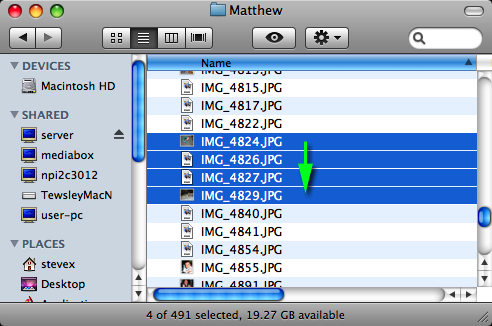
First, the Mac. When you're selecting items in a list by holding down shift and using the arrow keys, pressing the arrow in the opposite direction expands the selection the other way, rather than reducing the selection. Let me illustrate:
Here's a finder window where I want to select a few files. I start with the first file:

I hit the down arrow a few times to select some more files:

Now still holding down shift, I hit the up arrow.

What I expect to happen is one of the items I expanded the selection onto using the down arrow will be deselected and the selection will shrink. What actually happens is the selection grows at the other end.
This is different from how shift-cursor works everywhere else. In an editor, for example, if you hold down the shift key and move the cursor, the selection extends from the anchor (where you started) to the cursor (where you are now).
So why do some lists in the Mac work this way? I don't think it's a bug, so someone thinks this is how it should work, but I can't come up with a good reason for it. I often shift-cursor-down to select a bunch of files and then realize I went to far and need to back up; I have never hit shift-cursor down and then realized I started at the wrong place.
So that's my Mac beef. Here's the Windows one.
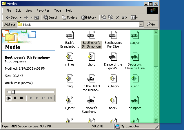
When you click the thumb in a scroll bar on Windows and move the mouse, there's a horizontal range within which you have to stay, or the scroll position snaps back to where you started.

This gets in my way because I click the thumb and start moving the mouse to scroll to read something, and because I'm not watching the cursor, it strays outside the green rectangle. And the scroll position snaps back to the top of the document.
Is this a feature to anyone? Old versions of Windows didn't do this, so again it seems intentional, but I don't understand the rationale.