Kindle Paperwhite Illumination
I had two concerns when I preordered the Kindle Paperwhite, and they were both related to the new built-in screen lighting.
The first was that because the light was actually built into the screen, instead of shining on the screen from externally, that in a dark room, the eye strain would be similar to reading on a backlit LCD screen.
Amazon said this wouldn't happen, because the screen is actually lit from the front by a special layer that's shining the light on the screen from the front. But I don't think this matters. In the end, there's a rectangle of light with sharp edges where the screen ends, and I believe this is what causes the eye strain: The sharp edge where you go from illuminated to dark.
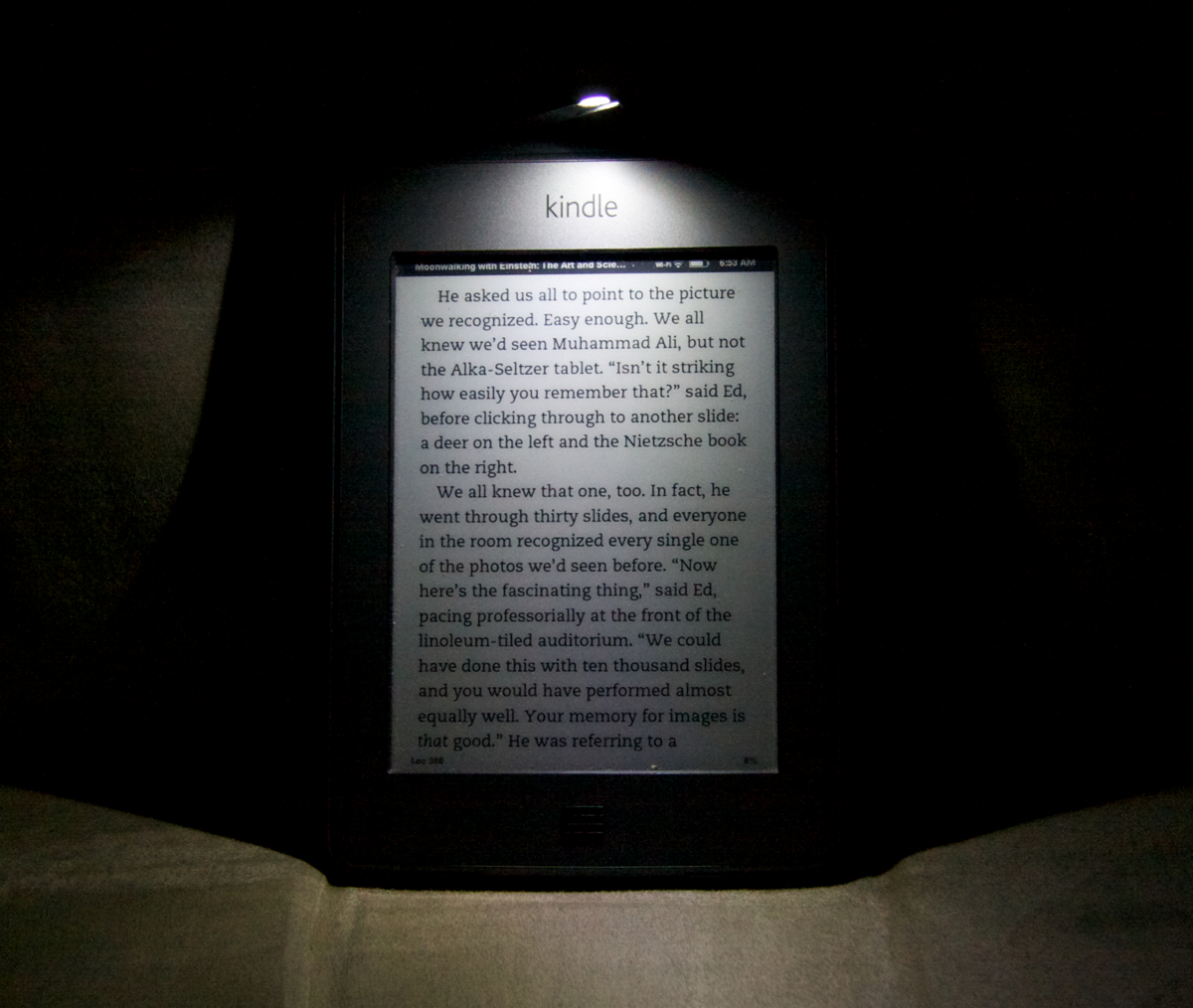
Now that I have the device, so far, I find this is as I expected. The device is definitely more strain-inducing than my old Kindle Touch with the Lighted Cover, and I believe it's because of exactly this factor.
Here's a photo of what my old Kindle looked like in a dark room:
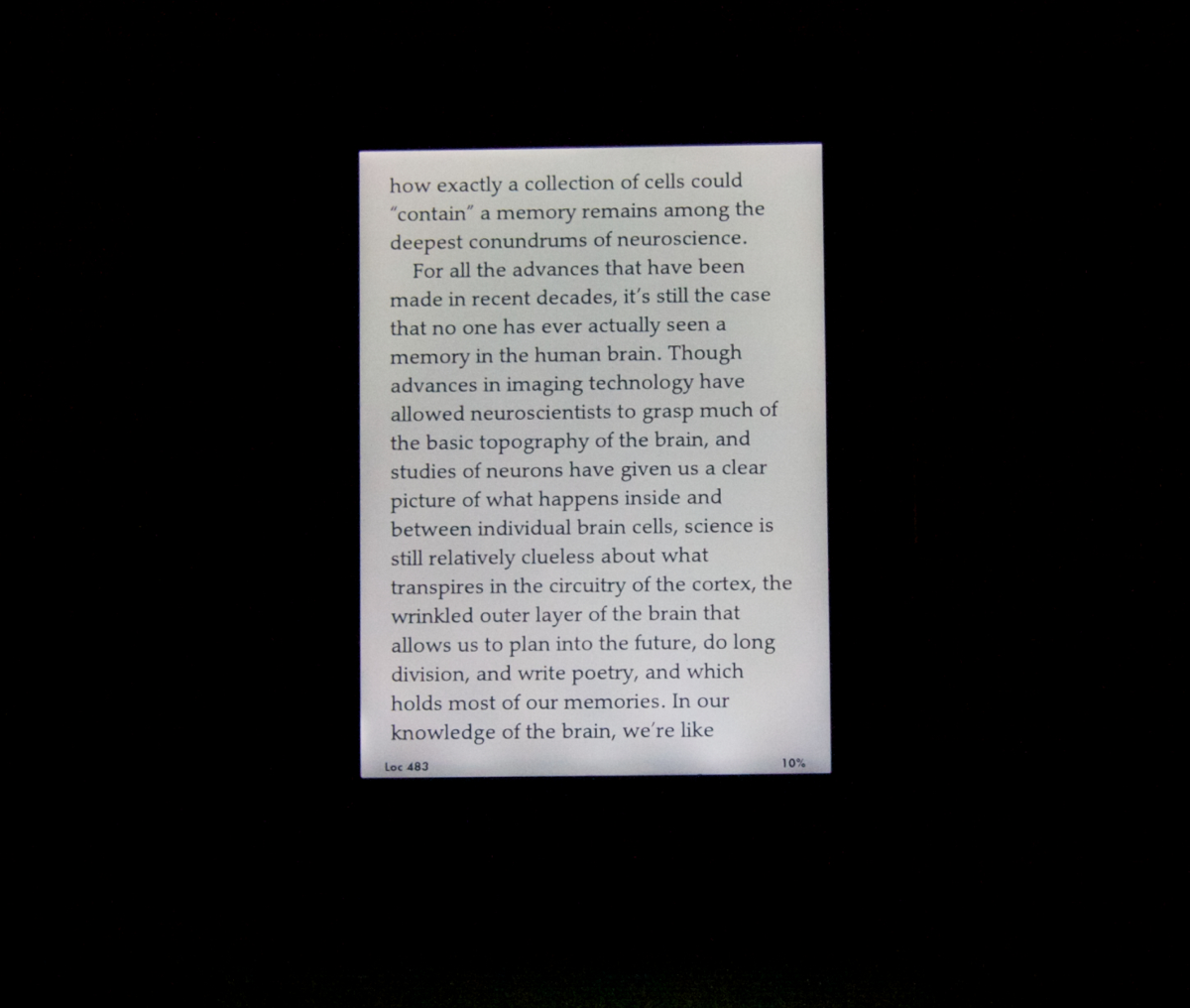
Here's what the Paperwhite looks like in the same setting, with the same camera settings:
Notice the, um, contrast?
My second fear with the new device was uneven lighting, and as you can see from the bottom of the second photo, that fear has been realised as well. It's not bad, but personally I find it a bit distracting that I can see these three spots at the bottom of the page that are glowing slightly differently than the rest of the screen. I don't think this is just a flaw with mine, as I've seen this mentioned by other people as well.
As a device for reading in very low light, it's not much better than a backlit tablet.
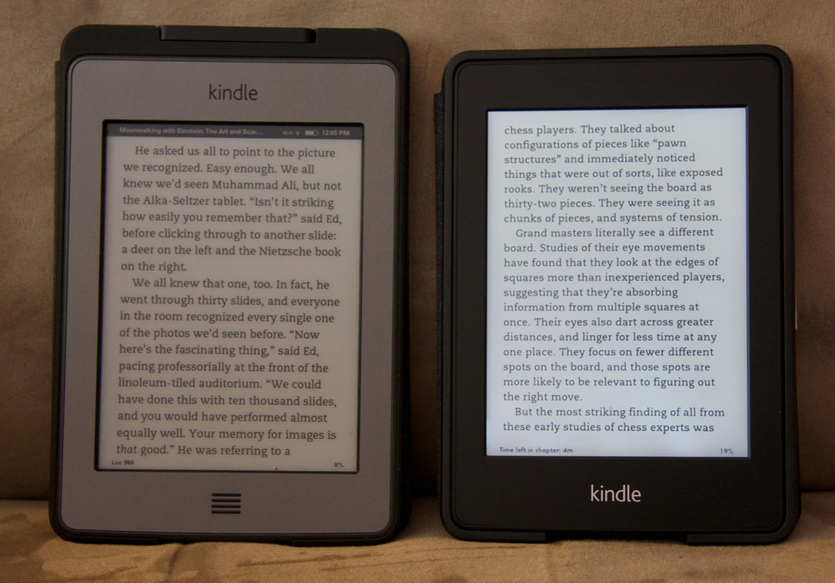
Here's another facet of the new display: How does it look when the backlight is off? Here are the Kindle Touch and the Kindle Paperwhite side by side, in average room lighting.
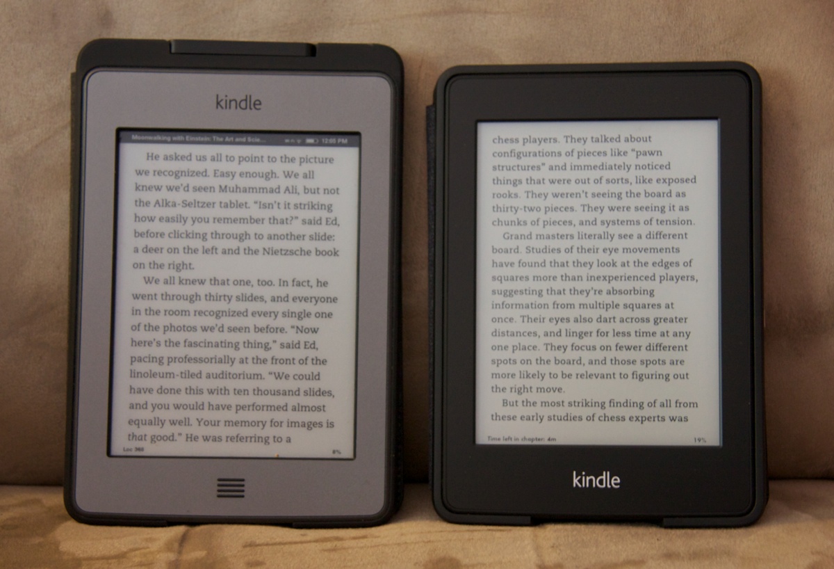
Not very different are they? The pictures you usually see of the Paperwhite have the backlight on. The backlight is subtle when room isn't dark. It makes the screen look better, without obviously glowing. Here's the same picture with the backlight on the Kindle Paperwhite at about 50%:

The darker bezel combined with the backlight makes it look like the screen has a ton of contrast, without actually appearing to glow. But it's the backlight that's the story here, not the contrast of the screen itself.


